Building Constellation
I spent three and a half years building a multi-brand, multi-platform design system for Lloyds Banking Group.
Lloyds is the UK’s largest retail banking group with over 30 million customers. It was an interesting journey; taking a product from small beginnings through to an established design system with an engaged community. Like any system, we changed and evolved based on user needs.
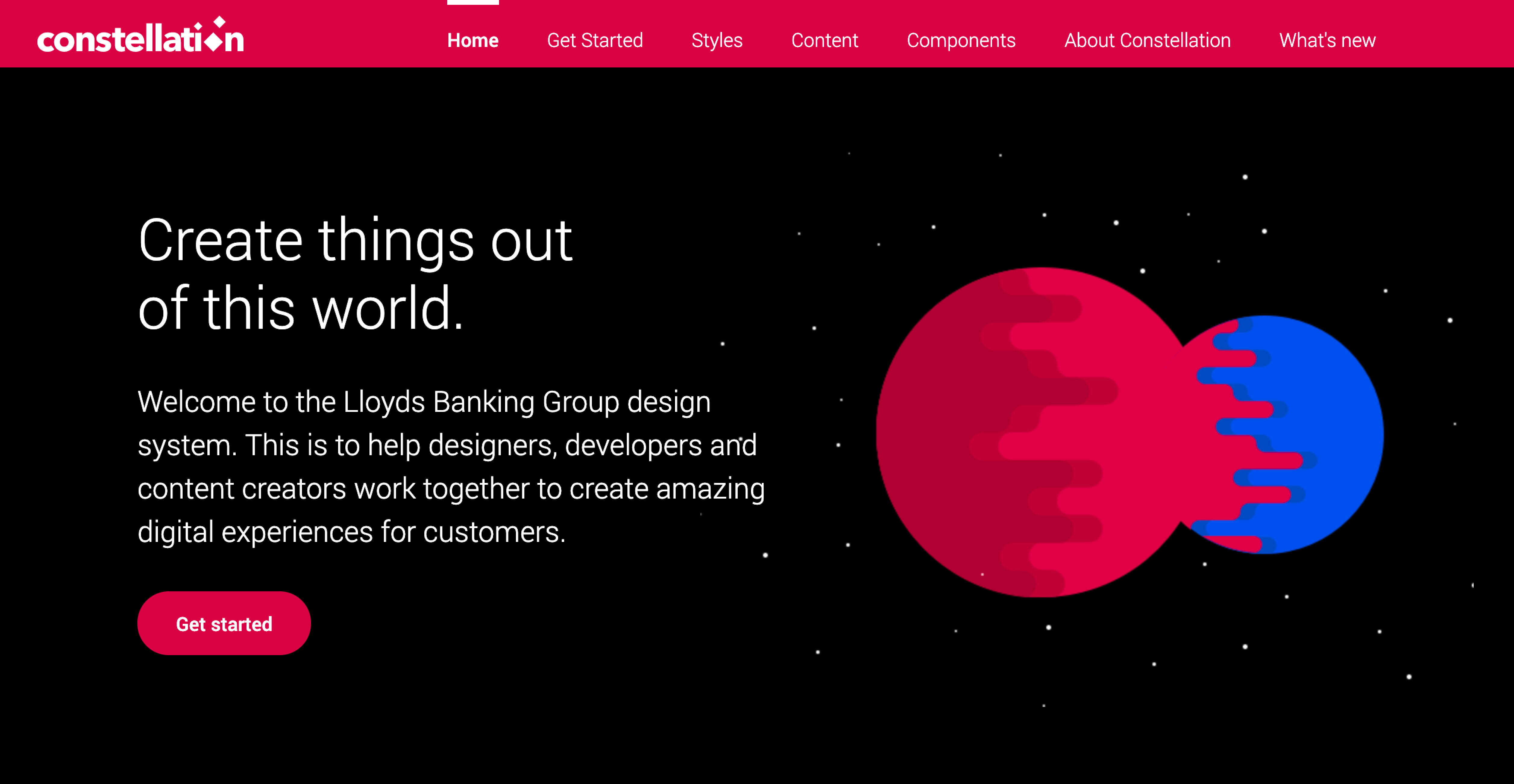 The Constellation Design system website
It wasn’t always plain sailing but smooth seas don’t make good sailors! I’m proud of my small team’s achievements. The design system is not open-sourced so here is a case study to share the journey.
What problem does it solve?
The aim of Constellation is to bring consistency across a visually fragmented digital estate. Historically, there have been different interpretations of the brand guidelines across value streams and product areas. Each team individually designing and coding their own interpretation of core components (headers, form fields, buttons) has led to significant variation.
Visual consistency is proven to help customer engagement. Inconsistent branding ultimately erodes customer loyalty and brand trust. Consistency is not limited to visual assets but extends to copy and shared conventions.
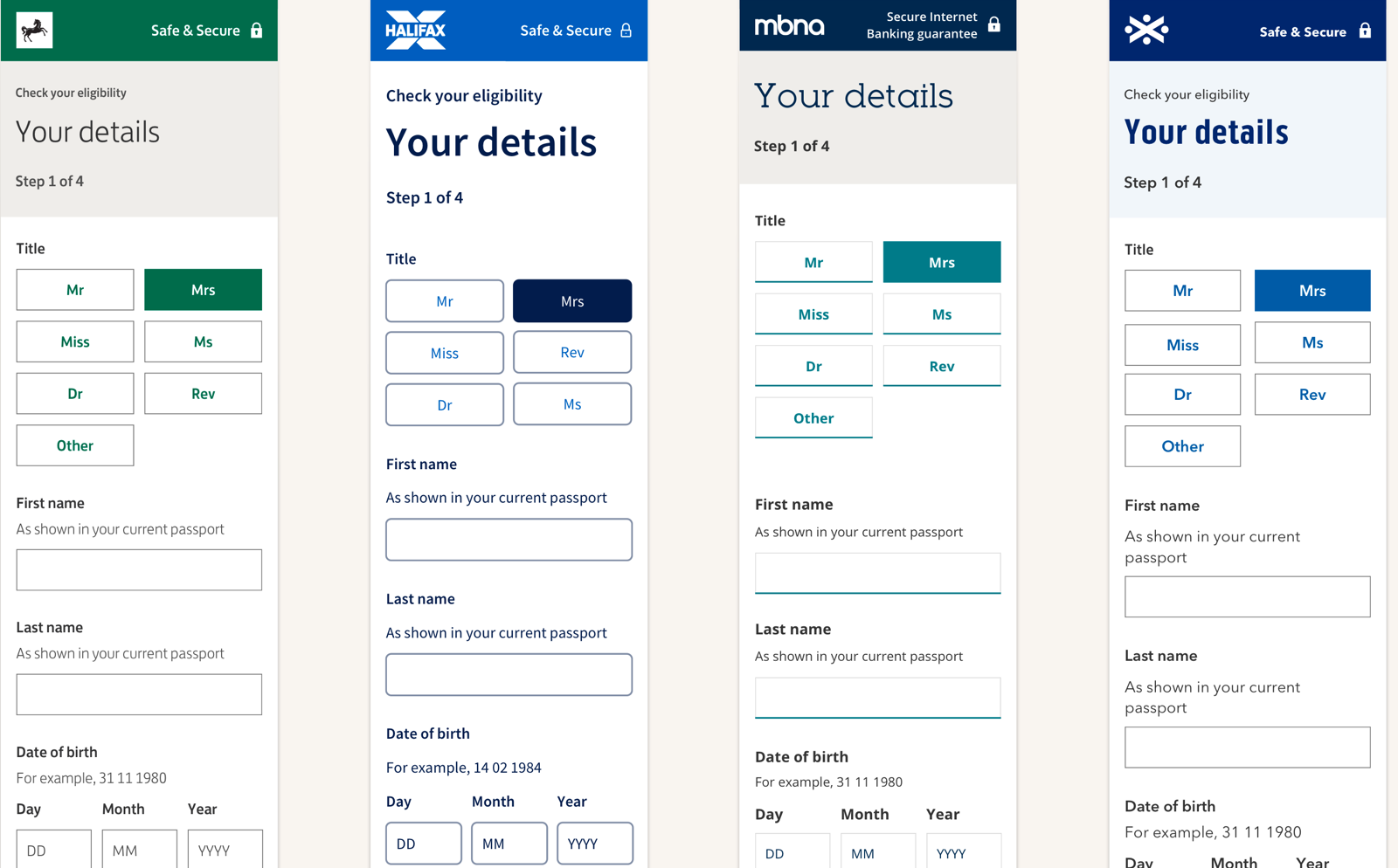
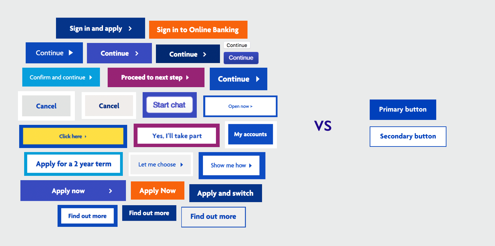 We replaced 26 button variations in Halifax brand with one primary and second button
Getting started
When I joined the team, we had the catchy name of ‘Unified Design System’ or UDF. Being associated with an acronym best known for a Northern Irish paramilitary group didn’t do much for the inclusive and welcoming nature of the team 🤗 so we decided to rebrand. We mooted lots of names, many horse related. We put it out to our end users who voted on “Constellation” — recognisable patterns that help people navigate.
Our junior designer created us a super logo. It wasn’t until we had stickers printed that we finally felt like a PROPER design system.
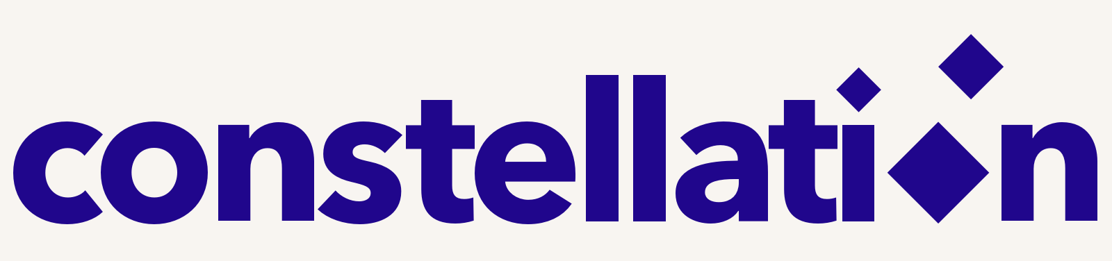
What to include?
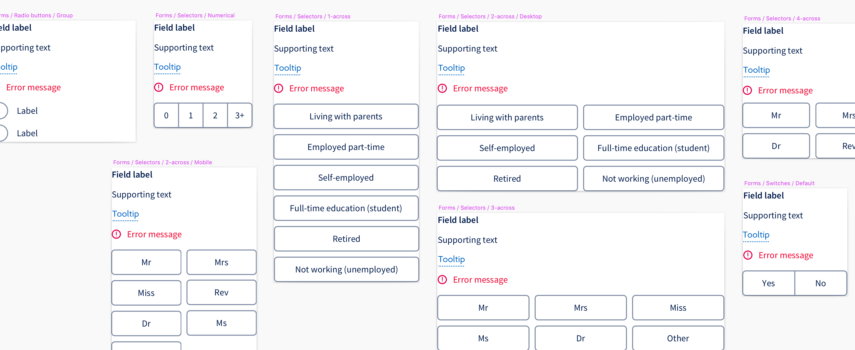
Before I joined, the team had decided to focus on form components. This was the quickest way to add value as application journeys feature heavily across the banks’ products and platforms.
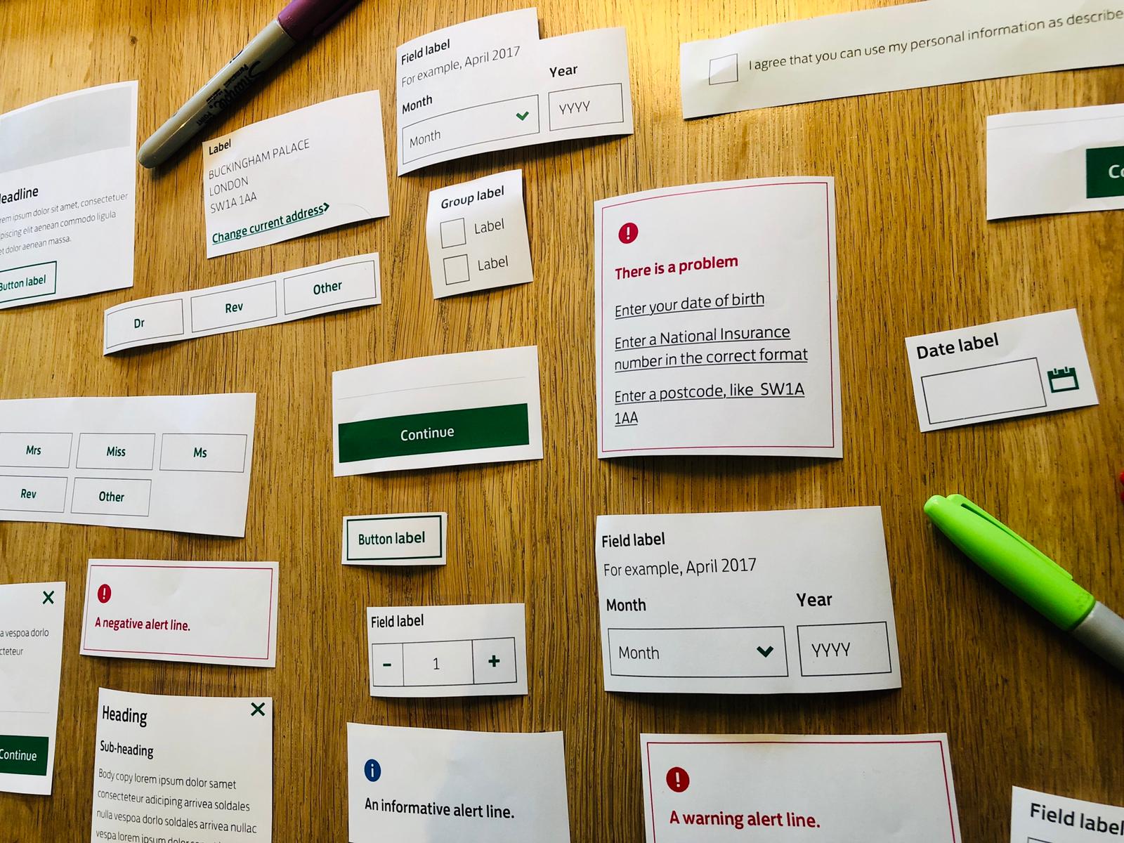
One of the most difficult early decisions was naming components and deciding on a structure. We ran a card sort with designers, developers and product owners. We based our structure and naming conventions on these findings.
Constellation covers four brands: Lloyds, Halifax, Bank of Scotland and MBNA. The complexity of a multi-brand system brings challenges — but also amplifies the impact of improvements.
Naming the thing is much more difficult than making the thing! Nathan Curtis’s articles were a valuable resource.
Website
Our components are built with React and code is our system’s source of truth. We built a pattern library site to expose the React components. Over time, the site grew to include:
- Editable props showing states and variations
- Links to Sketch libraries and example layouts
- UX best practice
- Plain English and brand writing guidance
- Accessibility standards
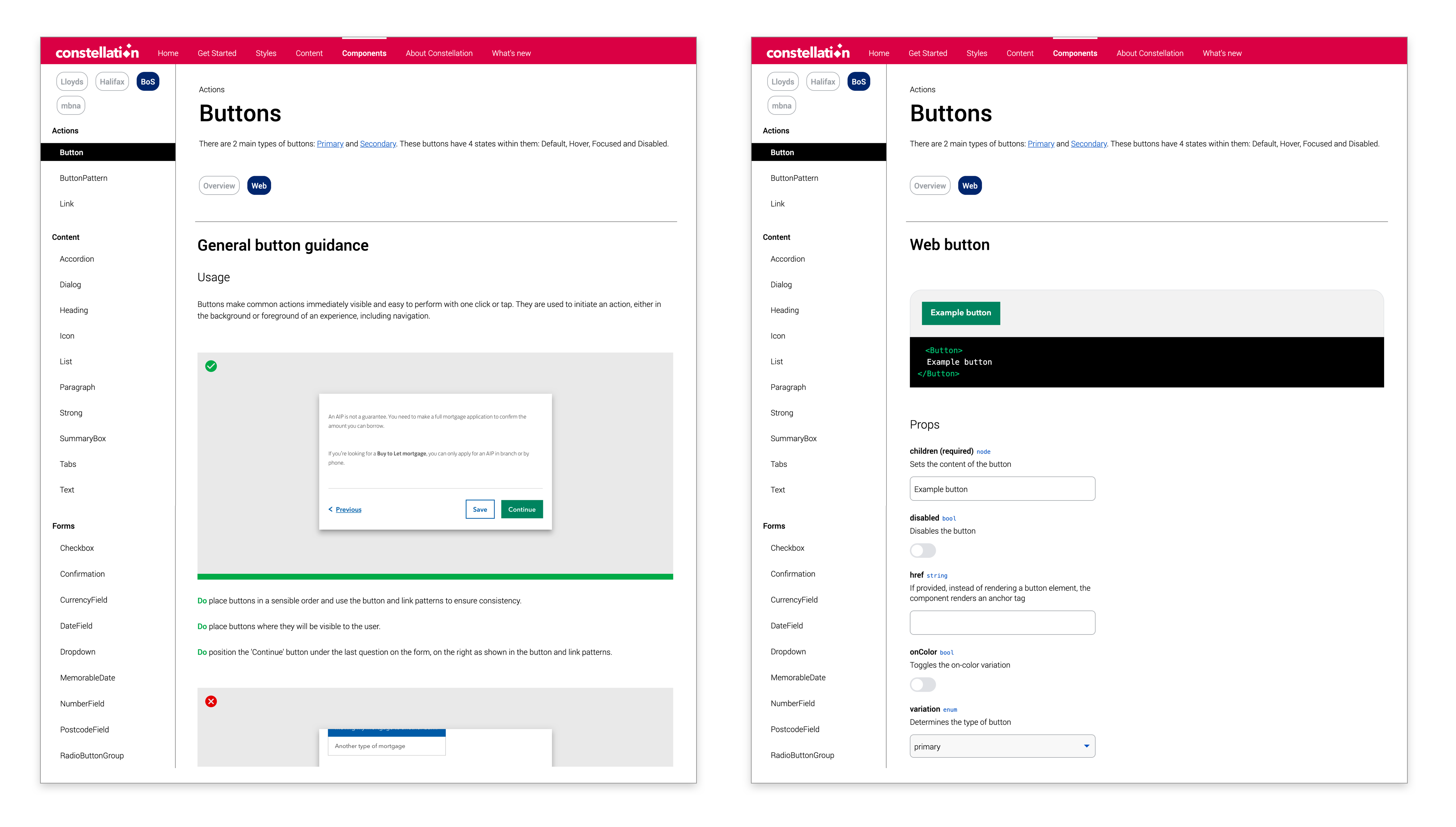
We iterated based on user feedback — replacing an elegant but confusing toggle with simple buttons. Simpler was better.
Sketch libraries
We started with static kits per brand. These quickly went out of date as people saved them locally.
We adopted RSS updates for Sketch libraries hosted on GitHub, using an AppleScript-based tool we nicknamed the “Deploy-o-tron.” We used semantic versioning to track changes.
Taking away Sketch kits caused pain — but sometimes disruption is needed for long-term gain.
Sketch brand swapper
We enforced naming consistency to support Sketch Symbol Swapper. This let us apply layouts across brands with one click.
We’re considering a white-label library for unbranded prototyping in the future.
Versioning design files
Our early “shout across the office” method didn’t scale. We evaluated various tools and adopted Abstract, a versioning tool for designers. Since then, no more overwritten files or lost work.
Advocacy
We struggled with visibility early on. We ran demos, attended hackathons, and launched a weekly drop-in clinic. Initially quiet, it’s now a valued collaboration session.
We also hosted a quarterly design systems meetup and shared invites via the Design Systems Slack #city-london channel.
Bumps in the journey
🤯 Imposter syndrome
Other systems always look better. But we were building for 30 million customers. We learned to celebrate small wins.
🛠 Move slow and fix things
We made early UI changes without consensus. Lesson learned: involve your users early and often.
🧑🚀 Contribution and feedback
We use Jira for bugs and GitHub for code. Our goal is to curate partial contributions and help other teams build on them.
♿ Accessibility
Some inherited components didn’t meet WCAG 2.1 AA. AbilityNet and Digital Accessibility Centre helped us raise the bar.
🧱 Incompatible tech stacks
Some teams couldn’t consume our components due to older React versions. We chose to stay up-to-date and help others plan accordingly.
🔌 Third-party plugin woes
We relied on Anima’s AutoLayout in Sketch. A Sketch update broke everything. We patched it fast, but learned to test betas before release.
Resources I’ve learned from
- Nathan Curtis’s Medium
- Form Design Patterns by Adam Silver and his blog
- Design Systems Newsletter by Stu Robson
- Accessibility for Everyone by Laura Kalbag
Design systems we admire:
Gov.uk, Backpack, Bulb, FutureLearn, Material Design, Uniform, Barnardo’s, Luna, Canvas, Aviva Standards, Carbon, MorningStar, Polaris
Next steps?
From small beginnings to saving £7 million in design and build costs — not bad for a team full of imposters 🙂