Foundations for the BPP design system
I spent 6 months at education group BPP, laying the foundations for their new design system and supporting on web accessibility.
So, who are BPP?
BPP are one of the UK’s largest providers of professional qualifications across law, accountancy and business. They’re going through a huge digital transformation project across product and tech.
If you want to check out the design system I helped build:
- Components are exposed in Storybook
- The system is documented on the Scholar zeroheight site
My contribution
I was engaged as a Web Accessibility Designer. It’s great to see big companies putting accessibility at the forefront, right from the system’s foundations. Along with clean code and clear documentation, accessibility was one of the team’s core principles. It’s a real joy to join a team who prioritises accessibility.
Here’s what I contributed to the design system…
☞ Choosing a name
I’m starting to question whether an in-house design system actually needs a name. I’ve worked in teams where the design system identity has sort of alienated the system from the core brand it’s serving. Maybe that’s just been down to the culture, or choosing the wrong name.
The team at BPP felt like the name “BPP Design System” was a bit of a mouthful and I had to agree. They wanted a name that was distinct, straightforward and represented their heritage brand. We workshopped, riffing off words around teaching, learning, progression and BPP’s lion mascot. We landed on:
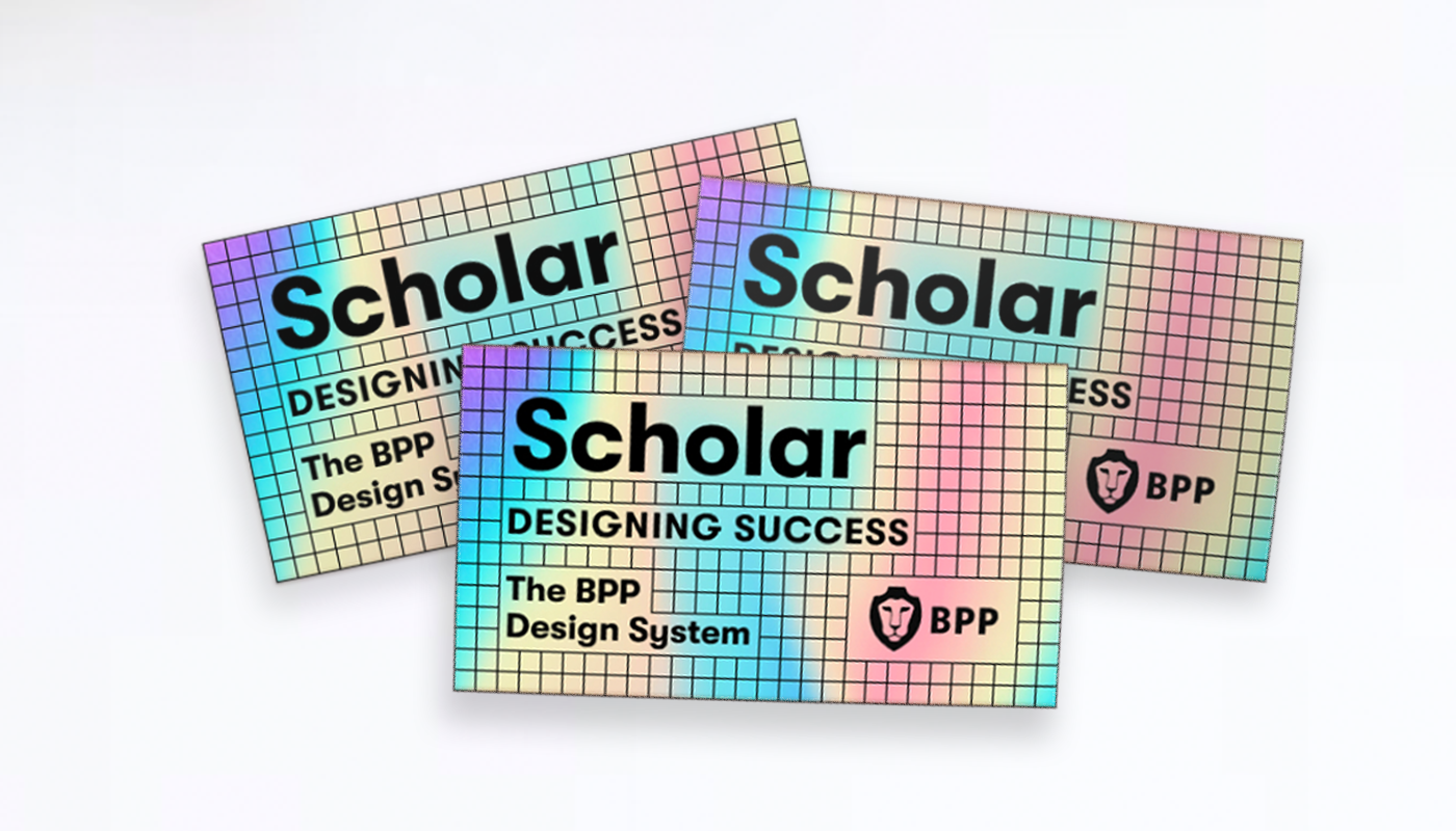
Scholar: Designing success
Scholar can mean student, specialist or learned person so as an education brand it covered off the different levels of end consumer nicely.
Everyone knows you’re not a real design system until you’ve got stickers so with our name sorted, we went ahead and ordered some shiny ones. I’ve only got a bachelor’s degree in design so being a Scholar made me feel fancy 💅🏻
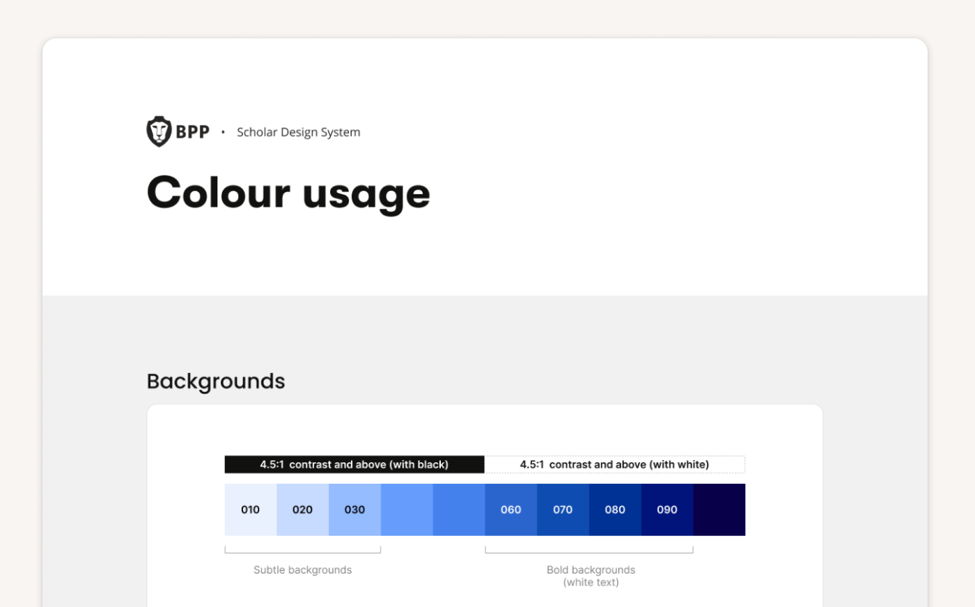
☞ An accessible colour palette
The existing BPP digital palette was limited and there were instances where achieving accessible colour contrast was not possible because there just weren’t enough colours to use. I interviewed designers who had concerns about using colours consistently without any usage guidelines.
I suggested that we introduce colour ramps and met with the Brand team to see if they would be onboard. Coincidentally, they were working on a brand colour refresh so we joined forces and workshopped a new palette.
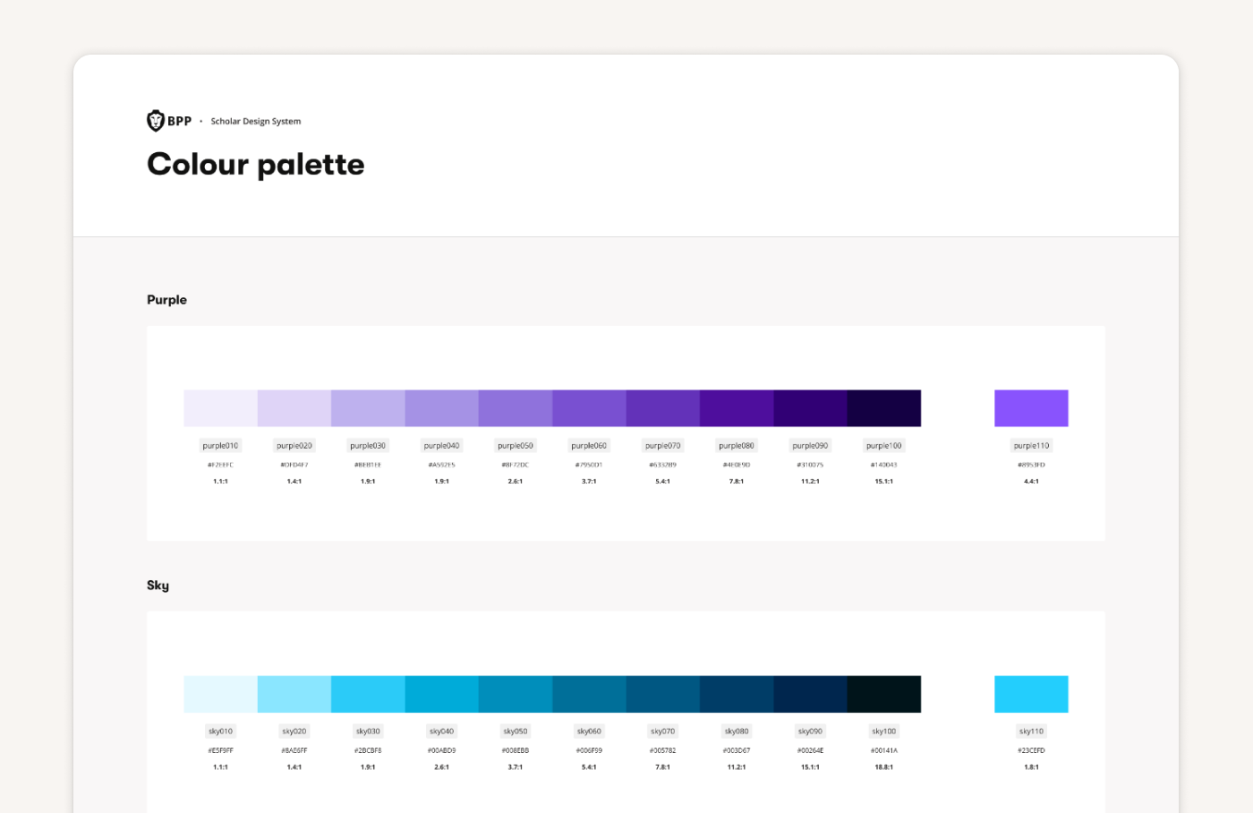
I used Leonardo to create colour ramps. You can set a lightness scale and define contrast stops which allows you to set rules for colour. I eventually settled on OKLCH which gave the most perceptually uniform colours.
If you’re also a colour nerd with a spare weekend to burn on colour spaces, this article on Smashing makes for a nice starter.
☞ Tokens
The existing component library worked off hardcoded values like hex codes for colours and pixels for spacing. This was working fine in Product but the designs we saw from the team rebuilding bpp.com required both a light and dark colour theme. It was clear the setup needed tokens to give the layer of abstraction required for theming.
I mapped out a token architecture, introducing just a single level above ramps:
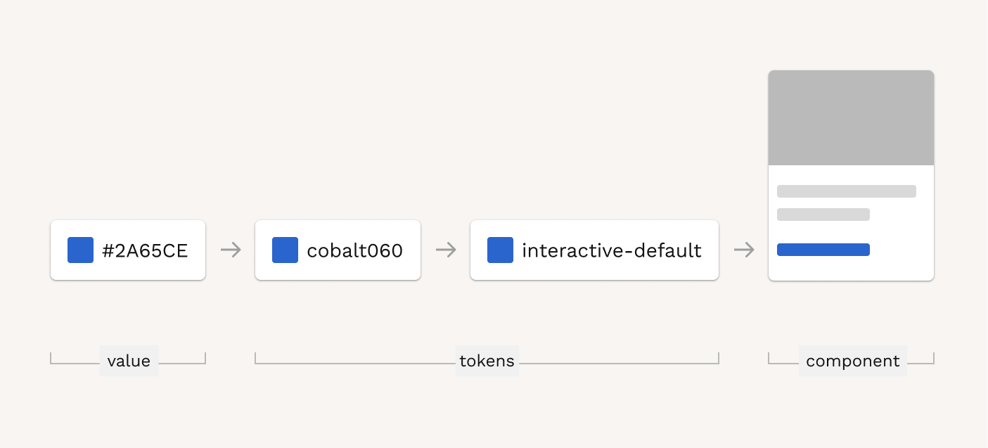
Token categories included:
- Base tokens: for default UI like text, icons, backgrounds, borders
- Interactive tokens: for interactive elements like buttons and links
- Status tokens: for status components like notifications and chips
- Brand tokens: to differentiate between brands
| Category | Usage | Intent | State | Variant |
|---|---|---|---|---|
| colour | base | positive | default | emphasis |
| interactive | negative | hover | default | |
| status | informative | active | subtle | |
| brand | neutral | visited | inverse | |
| ink | focus | input | ||
| interface | selected | 000-060 | ||
| disabled |
After extensive testing and applying tokens in Figma, we tweaked groupings, aligned code and rolled this out. We then extended our tokens across type and spacing as well.
☞ Building and documenting a whole lot of components
A few months in, the engineering team decided to re-platform Scholar. I worked with engineers to rebuild components in the new repo, getting specs together for behaviours, states, focus order and ARIA attributes. We prioritised the components needed by the bpp.com team and created a zeroheight site to document everything.
☞ Accessibility upgrades
I helped on several accessibility initiatives, including:
- Writing an accessibility statement and getting legal approval
- Presenting the colour upgrade at Townhall
- Starting an accessibility working group
- Teaching the team how to test with screen readers
- Connecting with Diversity & Inclusion
It was fun to work on the foundational setup of a system. Tooling has come on so much since I last attempted this. Figma variables and Tokens Studio did the heavy lifting on tokens and Leonardo made creating colour themes fast. It was a real pleasure to work with such a talented team and I’m keen to see the design system components and updated brand style rolled out.