Halifax digital rebrand
I worked on the digital rebrand of Halifax. The main brand identity was created by agency Rufus Leonard. As the UI lead in the design systems team, I helped take the visual identity and make it work for digital. Here’s what my awesome team made happen.
We started with the brand principles
When designing for a brand, I always start with the principles and brand strategy. Halifax is about people and making banking more human. It’s aimed at hard-working, down-to-earth folks who value brands that are on their level. My team was keen to reflect this in the UI – make it straightforward, no-nonsense and easy to interact with but not at the expense of brand personality.
An accessible colour palette
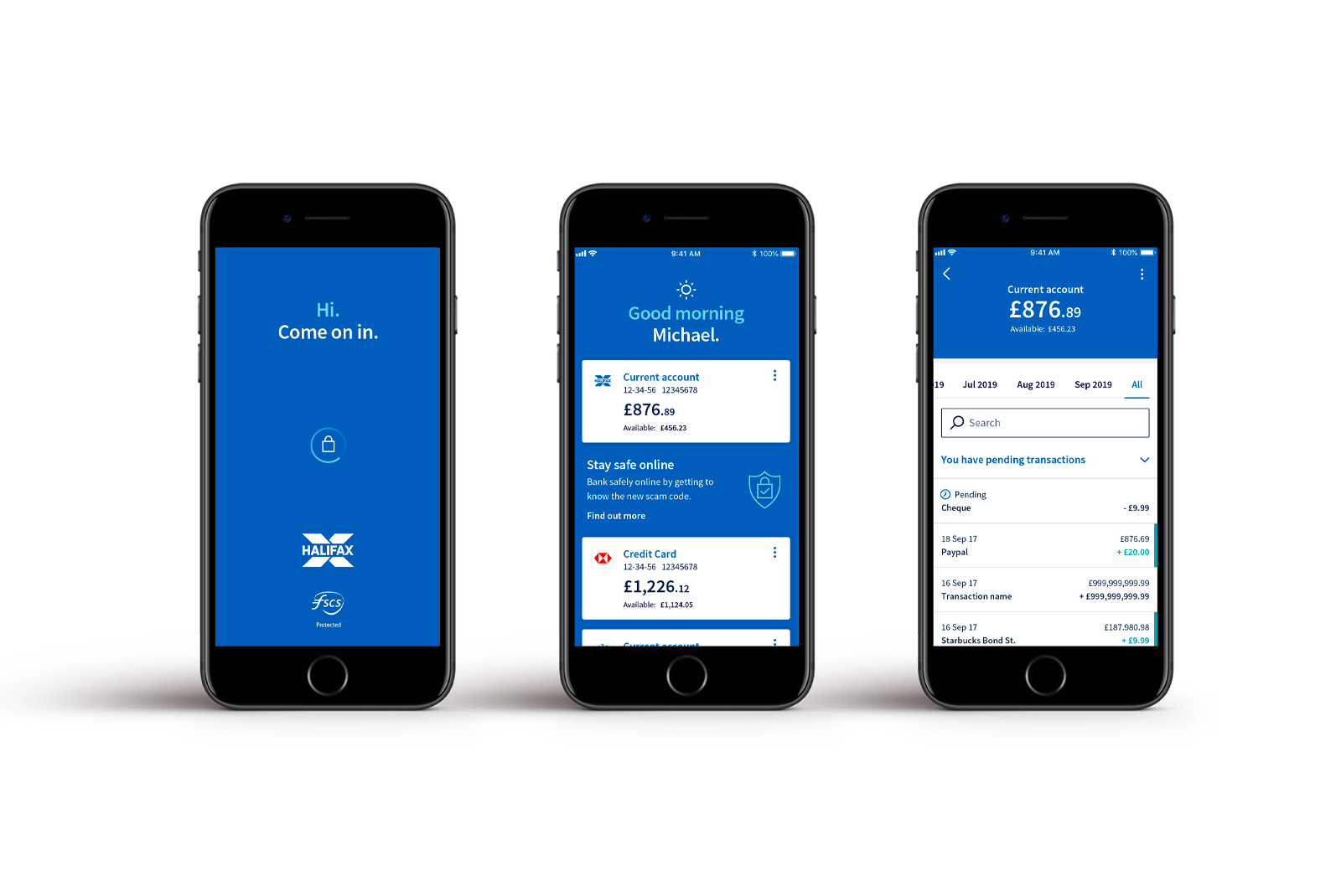
As a bank, it’s important that our interfaces are inclusive and accessible to all of Halifax’s 27 million customers. We comply with WCAG 2.1 guidelines to an AA standard. This means selecting colours that have sufficient colour contrast between the background and each other.
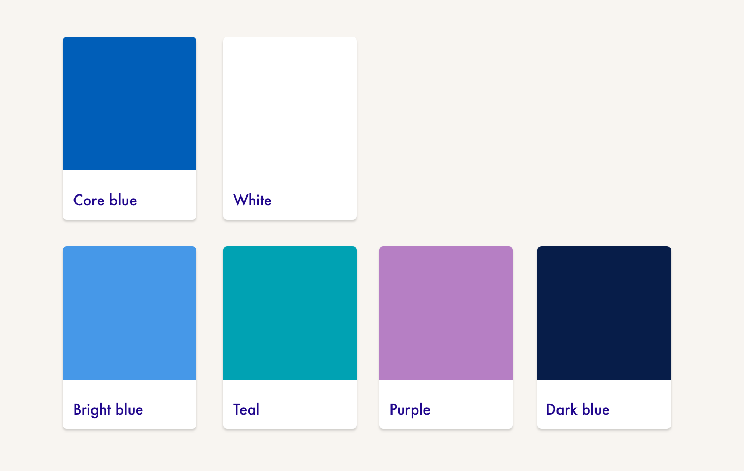
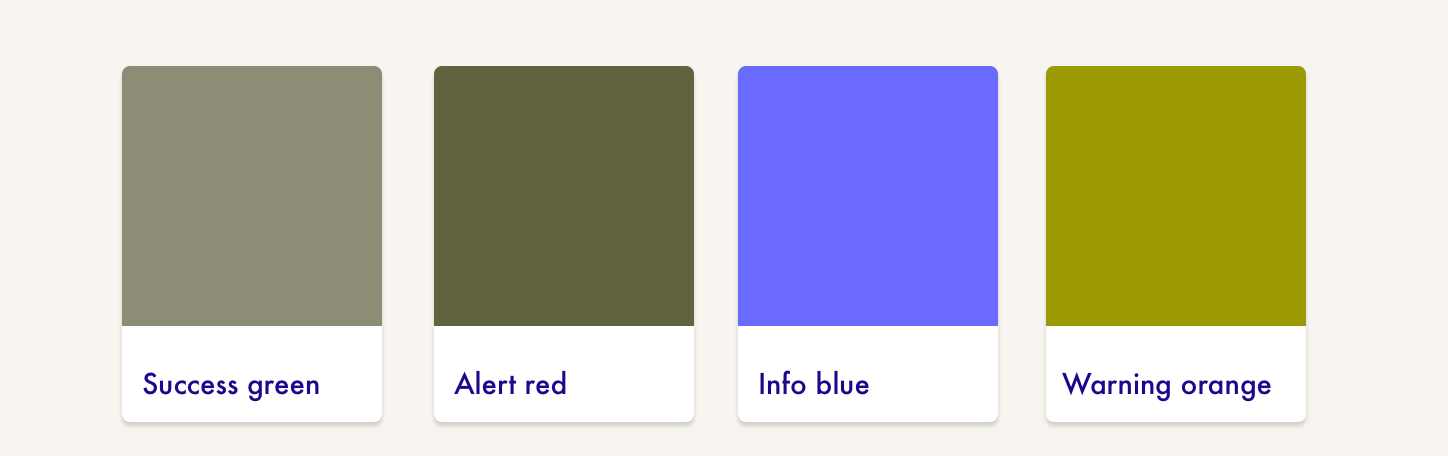
Primary palette
I worked alongside Rufus to tweak the palette to ensure it worked, not just in the big brand stuff but in the granular details; form components, focus states, buttons. We tested usage across different products from internet banking to the mobile app. Good colour contrast helps not just our customers with low vision but folks using the website or app outside in bright sunlight or while juggling another task.
It was also important to find a harmonious scale of colours that complemented each other and to specify proportions for use. I dug into a lot of colour theory and appreciated some of the super detailed guidelines shared by the community. As a small team of designers we really laboured over this… everyone got sick of me banging on about WCAG colour contrast ratios :)
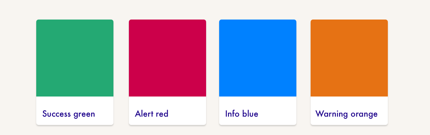
Functional colours
We created a set of functional colours with our colour blind customers in mind. Red/green is the most common form of colour vision deficiency and it can be hard to distinguish between alert and success messages. I experimented with a lot of different greens and reds. Again, finding a harmonious scale was important by tweaking the hue and brightness plus ensuring the colours for states both contrasted with and complemented the core palette.
Though a colour blindness simulator:
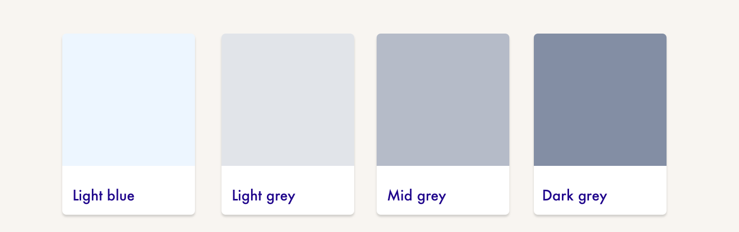
UI colours
A design system needs additional UI colours to enable the creation of complex components; greys and background colours for light/shade and depth. If you don’t spec these out and test them, designers will understandably add their own, resulting in gradual inconsistency. Rather than pure greys I used blue-greys which helped the scheme hang together. Text is also dark blue rather than grey.
Wut? That doesn’t seem like many colours (⊙.⊙)
We made a deliberate decision to limit the colour palette and not allow any variation. Our other brands have tints and tones of primary and secondary colours. In the hands of a design craftsperson these can really shine, but our design system is used by a lot of specialisms. We wanted a robust system that could be widely used and allow non-designers to feel confident in their choices. I’m pleased we did this — across the board it’s resulted in a much cleaner and consistent brand presence. The key was doing a lot of testing up-front and making sure all instances were covered.
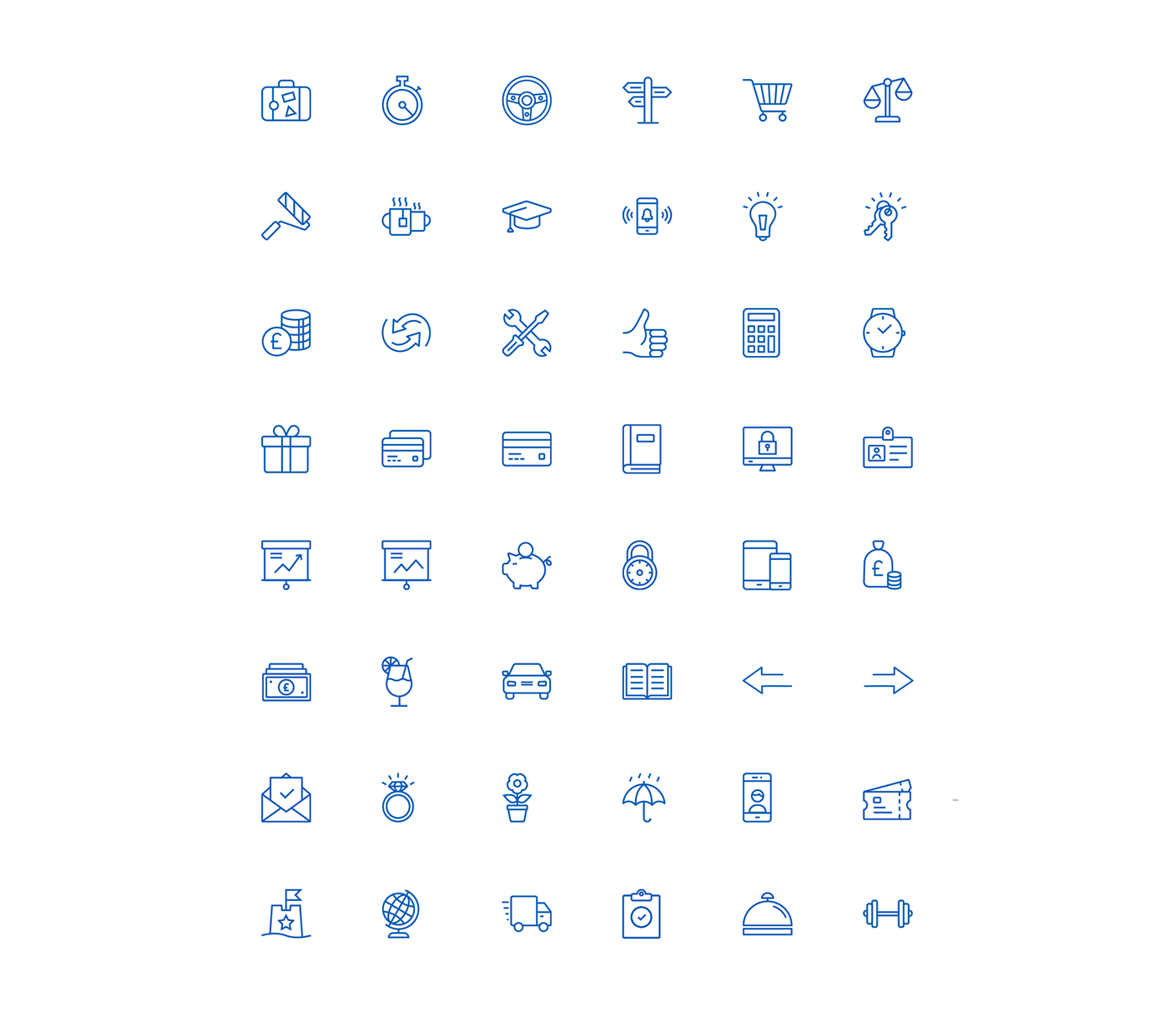
Icons and illustrations
Rufus Leonard supplied us with a brand style but it was down to my team to produce digital icons and illustrations. We got together an icon and illustration library, along with guidance for use. Line icons are notoriously difficult to scale and it took some experimentation to come up with a scaling system that worked.
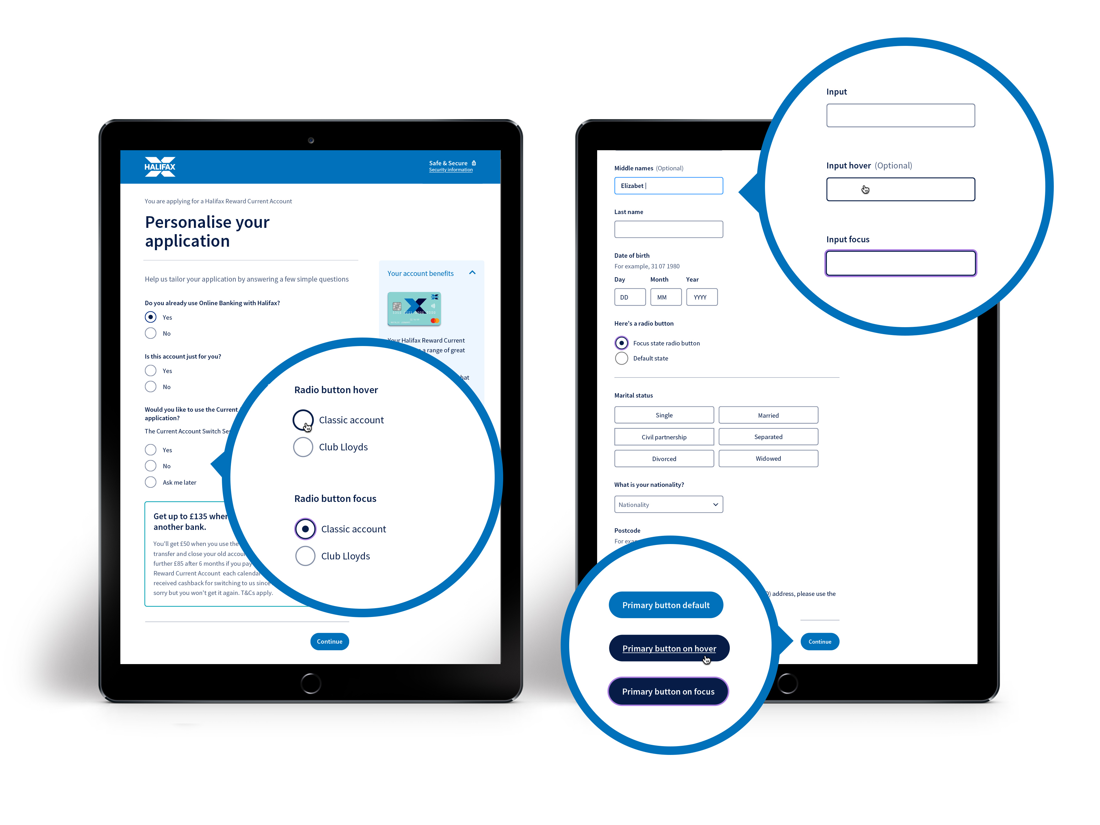
Accessible form components
I designed the set of form components for the design system. I tested these hard before finalising the spec. The Halifax brand is all about people and making banking more human. I was keen for this to come across in the design of all the little details – big radio buttons, fat focus states.
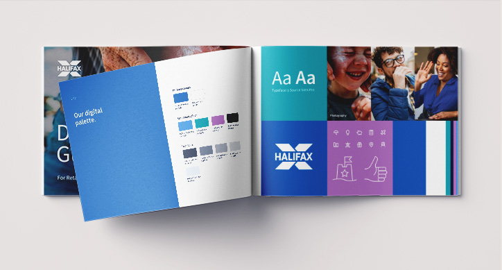
Digital guidelines
To help get designers on-board with the new identity, I worked alongside our content designer to create a set of digital guidelines. The main brand guidelines cover everything from billboards to letterhead and they can be time-consuming to grapple with. This is a smaller edit, just for the creation of digital products. It contains a short overview of brand strategy, principles and tone of voice then detailed guidelines on icons, illustrations, photography, graphics, etc. These were well received by the community and we’ve since been asked to create the same for our other brands.
Onboarding
Our design systems team runs a drop-in clinic each week where we invite designers, developers and product people to share what they’re working on.
We’ve used this clinic as a way to review designs in the new Halifax branding. When designs are looking good we help teams take them to a weekly design call where they are reviewed and signed off by Brand and Design. It’s been great to have this visibility across products and ensured journeys are true to the new brand. Most importantly, it’s highlighted pain points and areas that aren’t working for teams, that we can help to improve.
Rollout
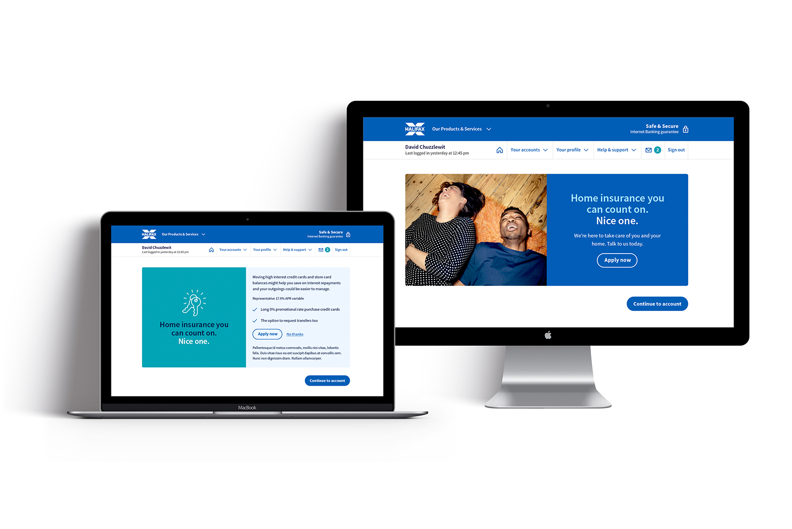
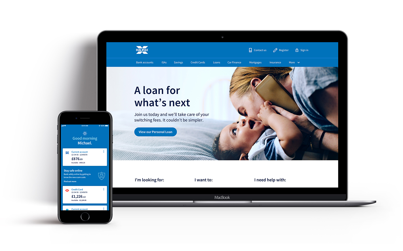
With such a large and complex digital estate, the rebrand has been slow to roll out. The public site was reskinned and I worked with the mobile team to align while they refreshed the iOS and Android apps. Our design system feeds mainly application journeys and these are slowly being updated and coming in-line. The rebrand has highlighted the value of a design system and it’s been significantly quicker to rebrand the journeys that were already using the system.
Personally, it’s a joy to see products being built using the components we designed looking fresh, usable and accessible.