Scaling accessibility with a design system
This is a post about my experience of learning how to design accessible web components, then scale their impact through a design system.
What problem does this solve?
Rather than everyone individually fixing the same accessibility problems, a design system enables an organisation to propagate accessible components at scale. Fixes are multiplied outwards saving time and money for product teams using the system.
Audience
I spent 3.5 years building a design system for Lloyds Banking Group. The design system supports 4 brands: Lloyds, Halifax, Bank of Scotland and MBNA. Any change made to a component like a button, form field or notification is pushed out to all brands.
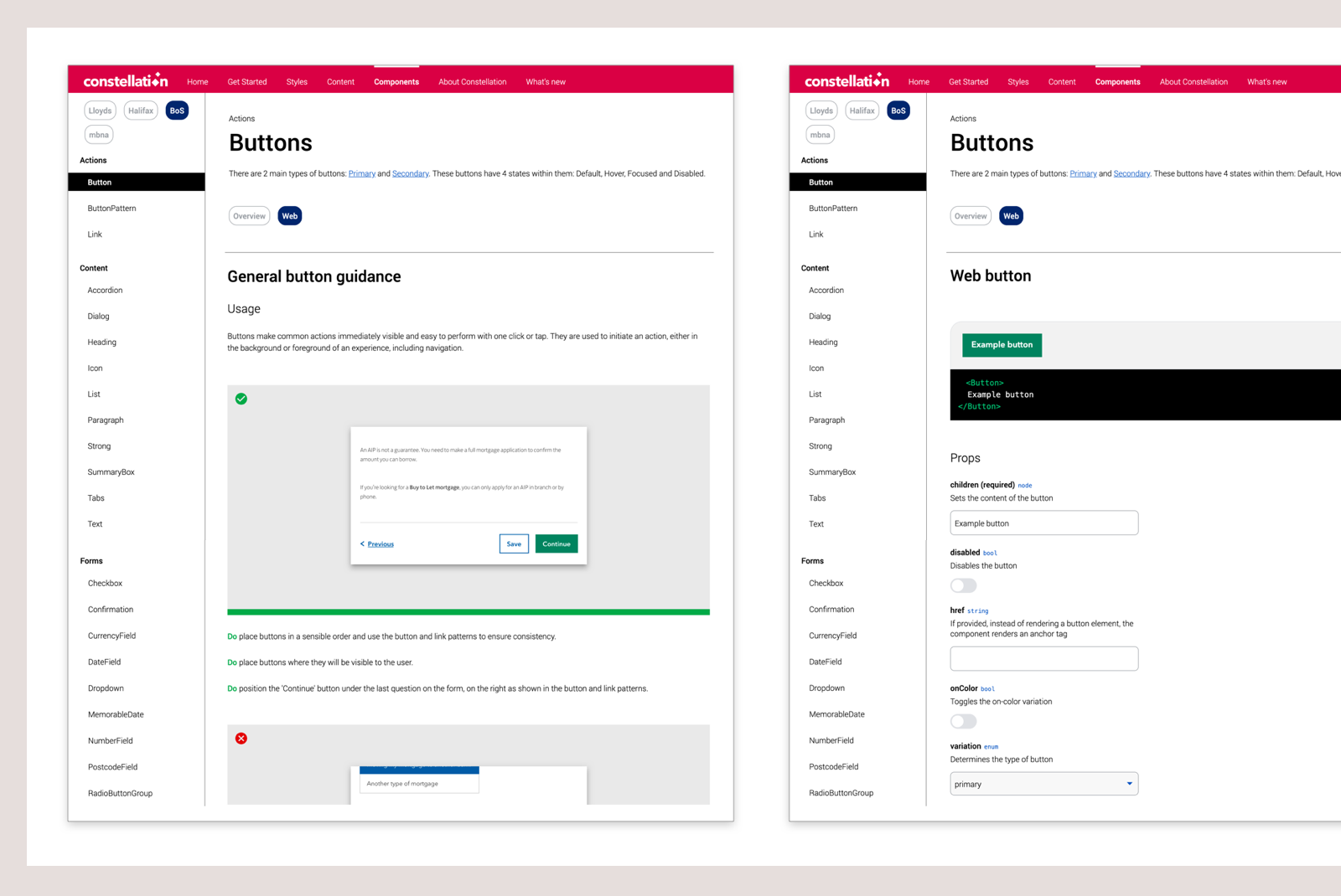
The design system ‘source of truth’ is React components, with corresponding Sketch design libraries. Components are served from a website which brings together UX, copy, and guidance for use. The system is currently used by over 30 product teams within the Lloyds Group; our main consumers are designers, developers and POs.
Accessibility is important because 1 in 5 of the UK population report a disability. There are also many temporary and situational scenarios that affect people’s access to online services. Lloyds conforms to the standards set by the Web Content Accessibility Guidelines and undertakes accessibility reviews to ensure products are accessible to and usable by all customers.
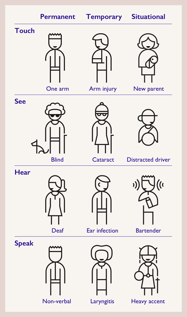
Accessible products are better for everyone. Along with users of assistive technology, there are many situational and temporary scenarios that affect the way people use the web.
Graphic adapted from Microsoft’s Inclusive Toolkit.
Legal and regulatory obligations aside, it’s been great to work for a company that has a genuine commitment to making inclusive products. Lloyds has an active Accessibility Guild, tools, testing, and clinics that designers are encouraged to take part in.
Research
Getting to grips with WCAG
WCAG stands for Web Content Accessibility Guidelines and is the benchmark for accessibility standards across digital products. If you’ve ever attempted to grapple with WCAG, it is initially an overwhelmingly complex set of guidelines.
I realised the only way to engage with WCAG properly was to set aside a whole day and read the guidelines end-to-end. I then read through again, noting all the criteria related to design. The guidelines are ordered by four principles of accessibility. When designing for the web, your content must be:
Perceivable, Operable, Understandable and Robust
Each WCAG guideline has a number of success criteria and also a conformance level: A, AA or AAA. Lloyds aims for AA. AAA is much harder to reach, especially with legacy systems and branding.
Specialist help
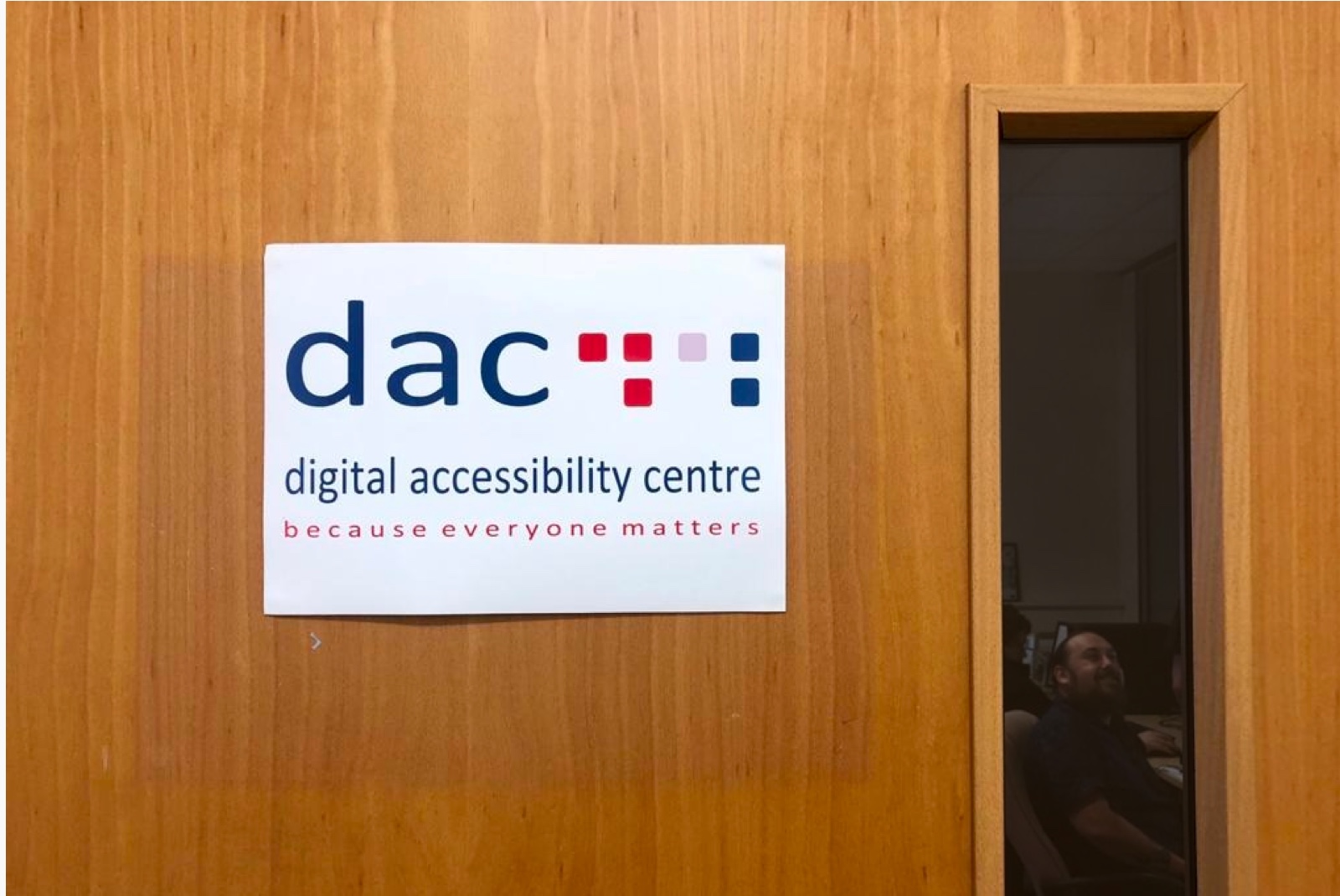
When I started my role I volunteered to become an Accessibility Champion – a program run by Lloyds Vulnerable Customers team. Through this I was introduced to the Digital Accessibility Centre, a not-for-profit that employs a team with a range of disabilities. They specialise in testing digital products using assistive technology.
Watching DAC’s Low Vision and Screen Magnification Analyst test our web components made me rethink the way I design. I realised how difficult it was for someone with low vision to interact with low contrast elements. Observing real users of assistive tech is eye-opening in a way that simulations never are.
Industry meetups
To understand accessibility outside my org, I joined meetups. Accessibility London is a great one. Talks are insightful and streamed with captions.
I met folks like Zeinab Ali from How Do I, who interviewed me for their blog.
Accessibility audit
I audited our design components against WCAG 2.1 AA criteria. Accessibility for Everyone by Laura Kalbag helped me prioritise. As a designer, these were my focus areas:
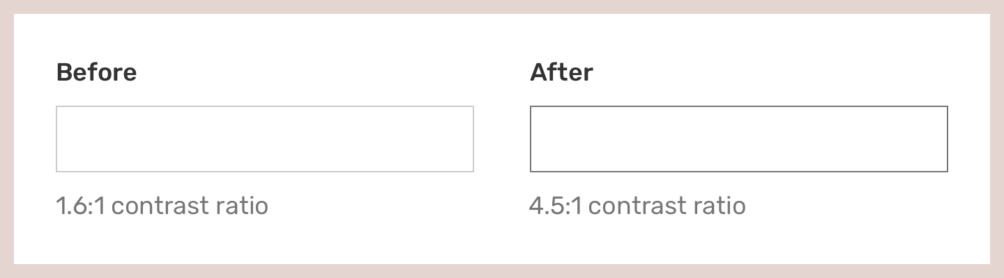
Contrast minimum: WCAG 1.4.3 (AA)
Contrast ratio should be:
- 4.5:1 for text smaller than 24px or 19px bold
- 3:1 for text larger than 24px or 19px bold
I used Colour Contrast Analyser and Stark to check values.
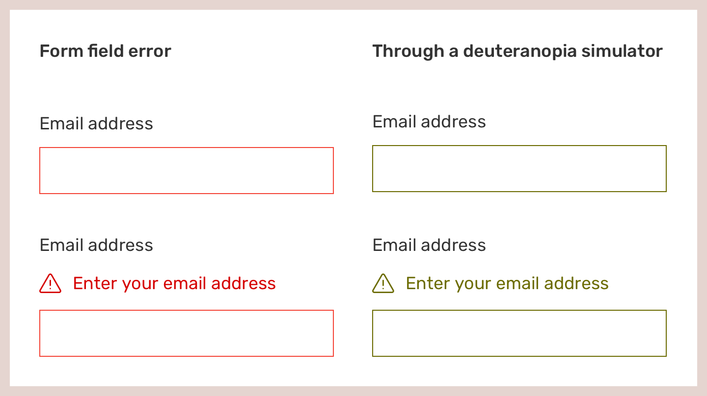
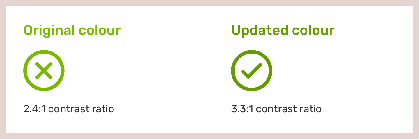
Use of Colour: WCAG 1.4.1 (A)
Don’t rely on colour alone. We added icons to error states, alerts and notifications.
Non-Text Contrast: WCAG 1.4.11 (AA)
We changed input field colours and adjusted alerts to meet contrast standards.
Meaningful sequence: WCAG 1.3.2 (A)
Structure matters — screen readers and CSS-disabled views depend on it. We reviewed how headings and content blocks were used across journeys.
Text Spacing: WCAG 1.4.12 (AA)
Users must be able to increase:
- Line height to 1.5× font size
- Paragraph spacing to 2× font size
We updated Sketch text styles and worked with devs to reflect this in code. Smart components using auto layout help here.
Testing
When the React components were ready, we brought in AbilityNet for accessibility testing. Their review found:
- ✅ 0 high priority issues
- ⚠️ 22 medium and 3 low issues — all resolved
We can now say our components conform to WCAG 2.1 AA.
Feedback and support
This process taught me so much. Constellation (our design system) has proven its value in scaling accessible components across brands.
But — accessible components don’t equal accessible journeys. Semantics and copy matter too. Nathan Curtis says it well.
We run a weekly support clinic for teams. Fixes to shared components benefit everyone using the system — and their users.
Resources I’ve learned from
- Web Content Accessibility Guidelines (WCAG)
- Understanding WCAG 2.0
- Accessibility for Everyone by Laura Kalbag
- Digital Accessibility Centre
- AbilityNet
- GDS Design System
- “Accessible” Design Systems Don’t Guarantee Accessible Products
- Website Accessibility Checklist by Bruce Lawson
- Color accessibility: tools and resources by Stéphanie Walter
- There is no “Myths of Color Contrast Accessibility” by Geoffrey Crofte
- Designing accessible color systems by Daryl Koopersmith and Wilson Miner